
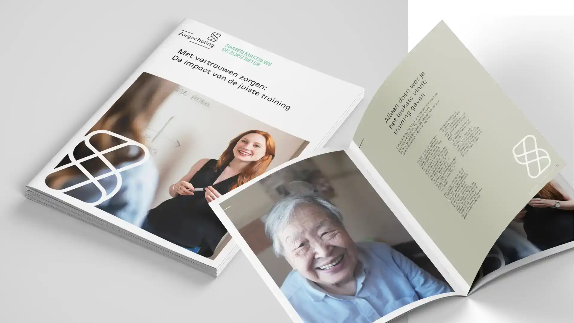
An academy with a mission
Zorgscholing had strong content and solid tech, but lacked visibility. We put its mission front and center, gave it a distinctive visual identity, and built a website that converts better.

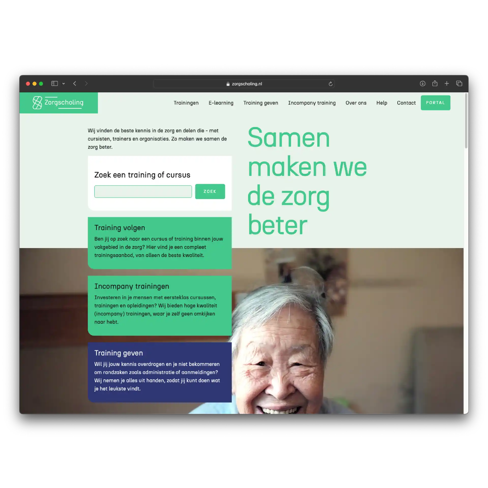
Zorgscholing.nl
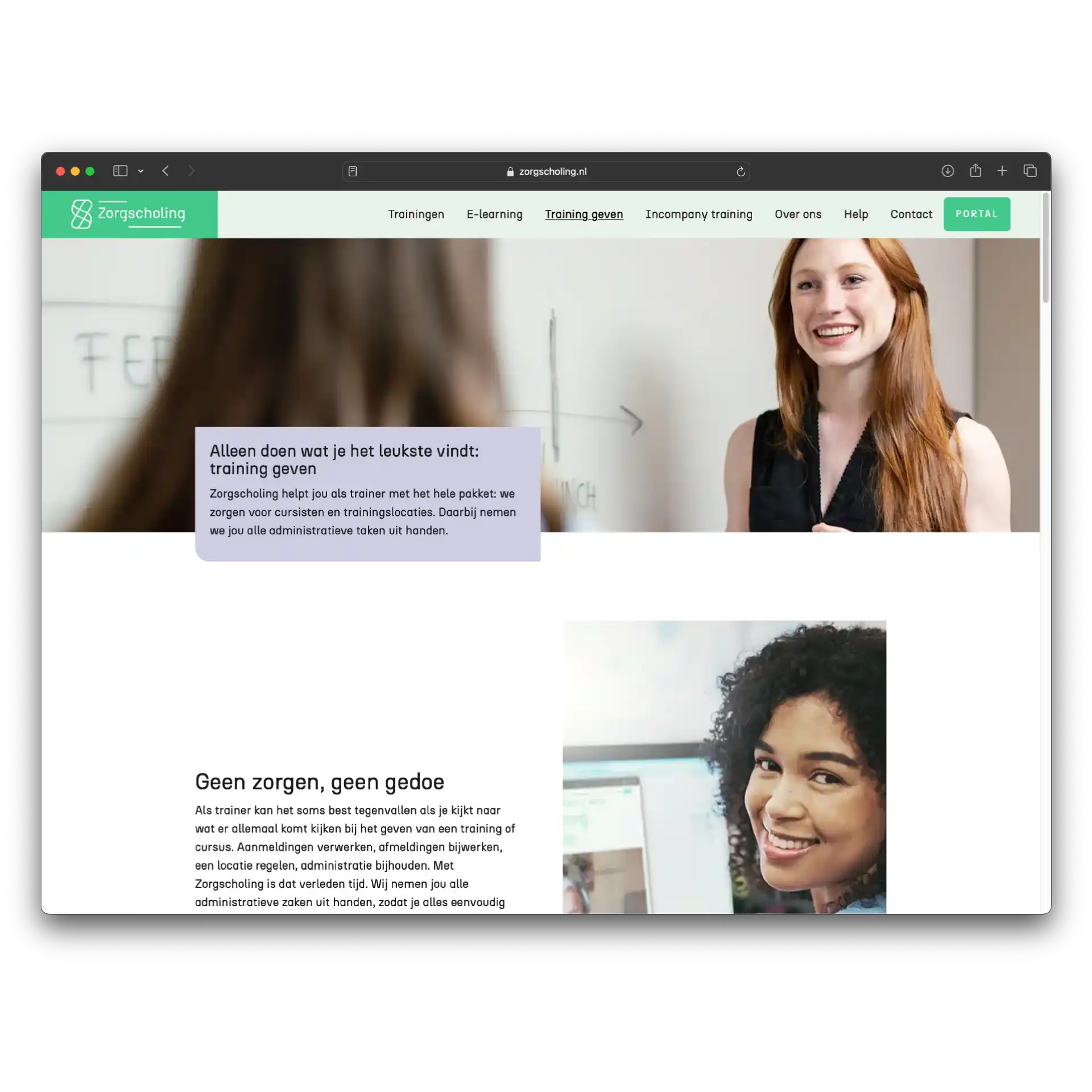
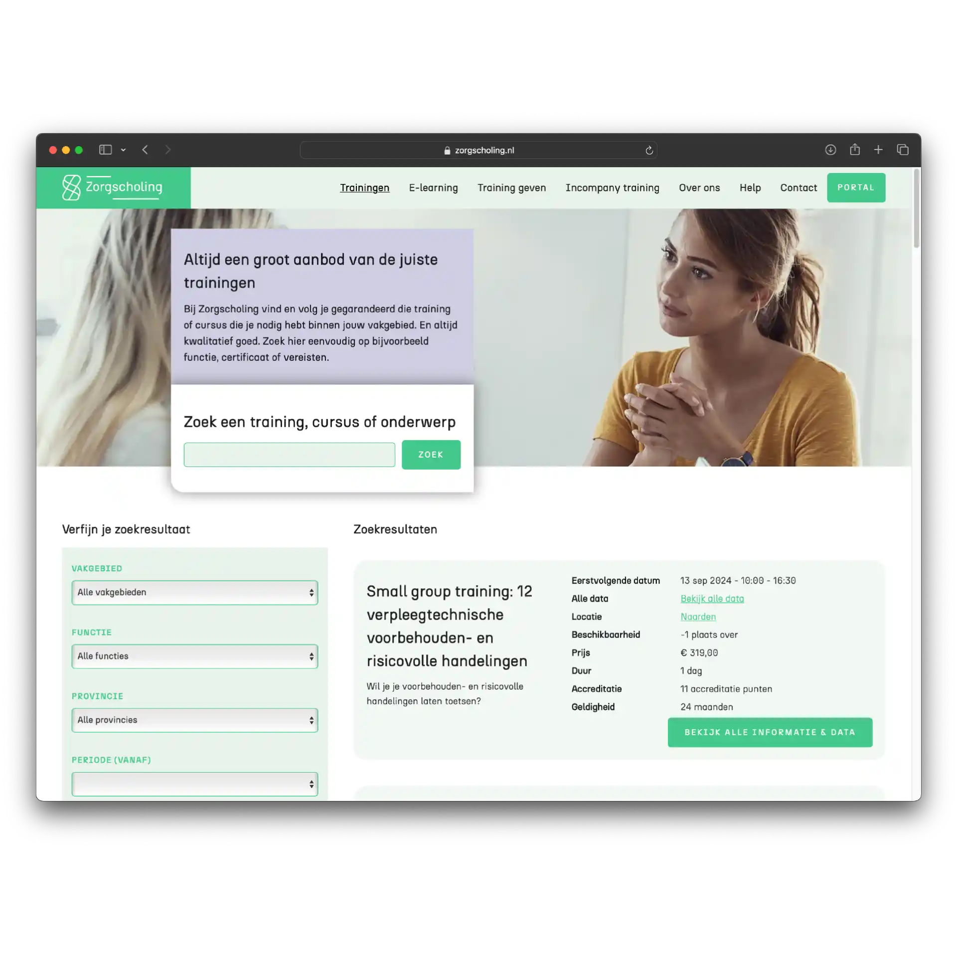
Zorgscholing helps healthcare professionals continue their development with an easy-to-use platform, a wide range of courses, and experienced trainers.
A platform with more to say than courses
The organization was mainly seen as a course provider, while its real mission was to improve healthcare by sharing knowledge. The challenge: how do you make that mission clear to everyone?
Not the offering, but the goal
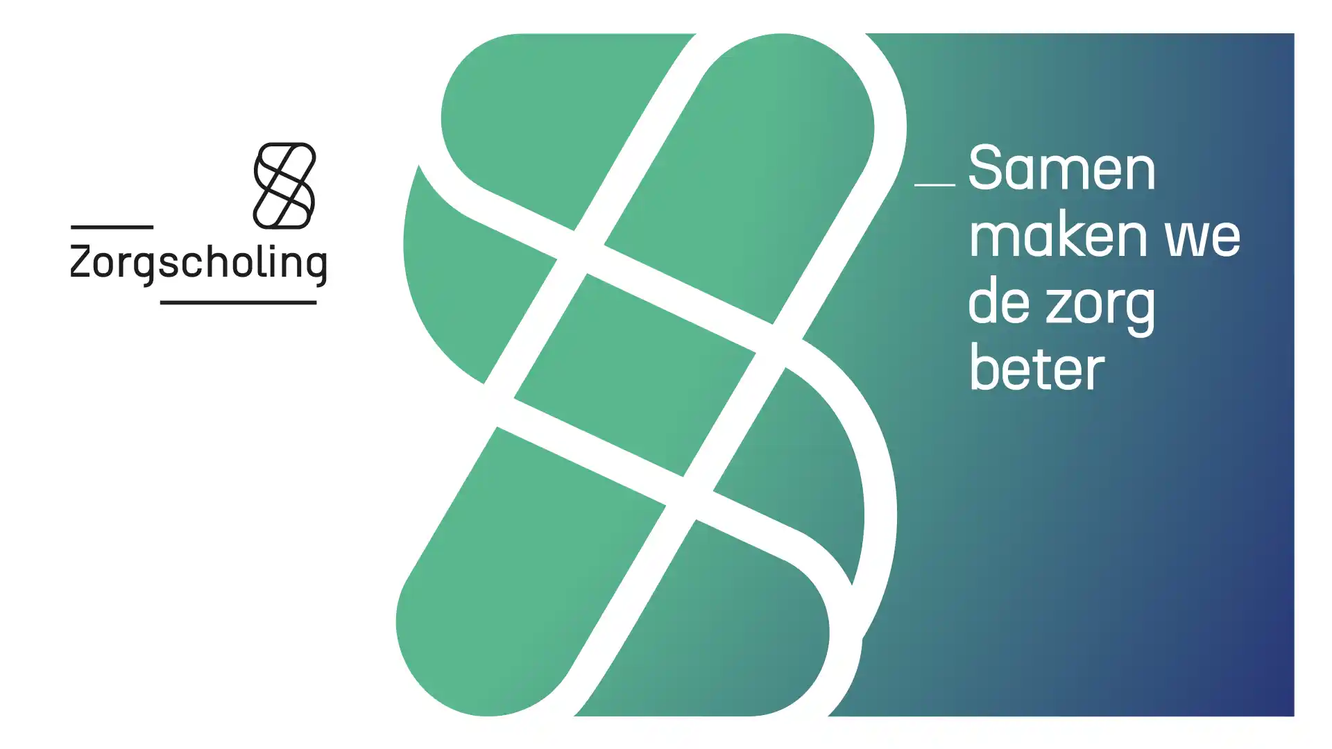
We made the mission the foundation: improving healthcare together. Everything had to strengthen that. The symbol of an endless loop shows learning that never stops. The tone of voice and seamless link between site and platform make it both easier and more meaningful. Clearer and more compelling.

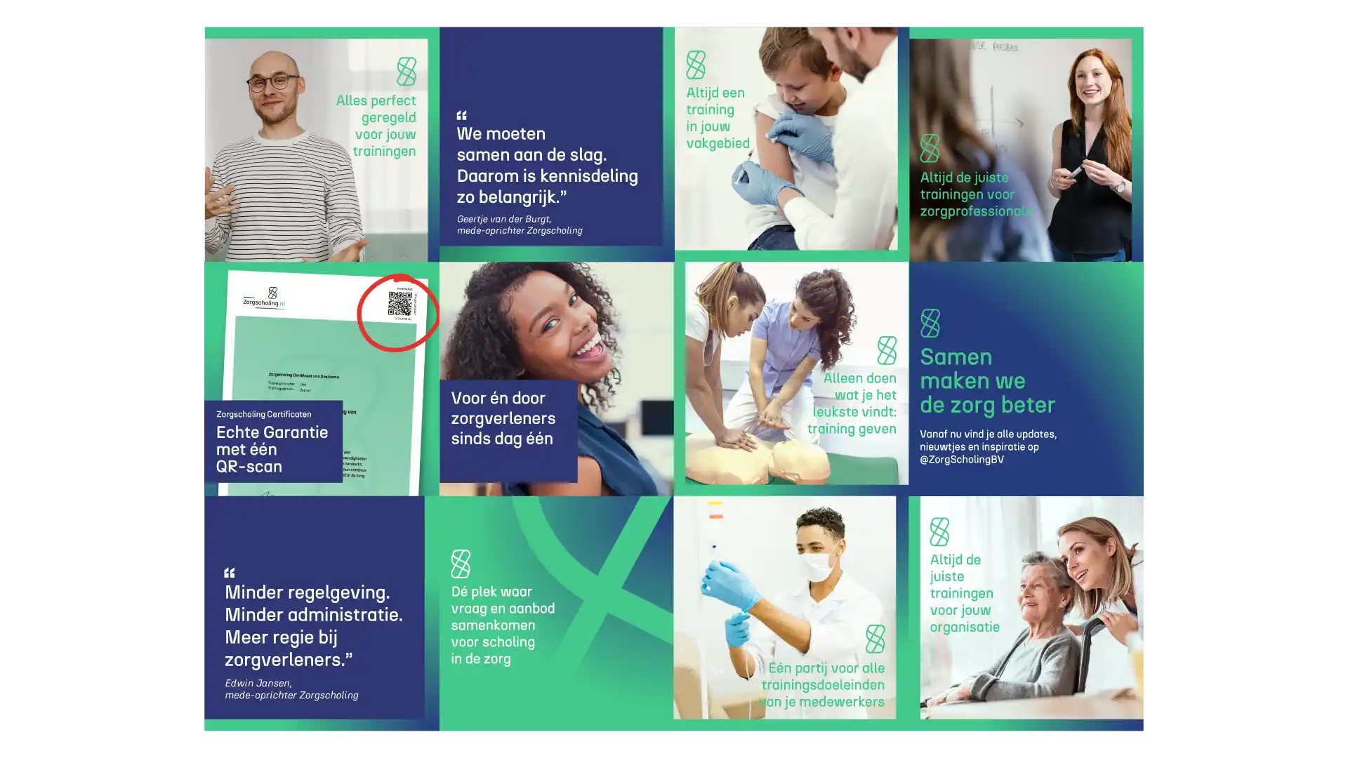

A brand that’s easier to find and easier to choose
The mission now lives in every expression. The site converts better and ranks higher. Zorgscholing receives more targeted requests and is ready to expand its role as a connector in healthcare.
A brand that’s easier to find and easier to choose
The mission now lives in every expression. The site converts better and ranks higher. Zorgscholing receives more targeted requests and is ready to expand its role as a connector in healthcare.